8.23.2012

Trish the Witch book 2


Working on some great wee projects at the moment. Quite happy altogether.
The all new Trish the Witch book 2 has went off to the printers just yesterday. I'm very excited about this altogether as I've tried to do something very different with this one, wait for it.... No white pages for backgrounds. This may not be a big deal to anyone else, but for me it means alot. Firstly, it means that there's a more rich and colourful look and feel to the book. (I think kids will love that and parents will feel like the book is worth more)

Secondly it means that there's more room for error. We're working with lithography this time around to accomodate the larger print run and more ink. Previously we used digital printing. Naturally I've had to be more careful with this book than the last as we're using white typography and alot of colour around the edges. I've outlined the text and made sure to send over the fonts (just incase I missed anything). I've even done some prepress production on the documents to make sure nothing goes wrong.

3.17.2012

So today is St.Patricks Day, which means that I've less time than usual to post as I've a parade to attend and have to find something green in my wardrobe. Oh and Happy St Patricks Day to anyone that's reading this.

Typography is essential for a graphic designer to get to grips with. You just have to google top ten tips for graphic designers and the word typography pops up at least once everytime. In the past, I had a habit of shying away from typography believing that my illustrative skills were enough to carry me through a career of creativity, and for some that works quite well... but not for me. This year I've decided to learn more and more about the field of typography, pushing myself further and more into styles and fonts that I've not before experimented with.

Did I mention I'm now an intern at a local NPO? No? Well, I am. And it's a great experience for me. I'm currently working on LGBT campaigns within the locality. I pretty much have creative reign when it comes to ideas for new projects and this allows me to work on skills that aren't as perfect as others. So basically I get to work on the typography skills mentioned above in this placement.

Here's the first of many new type based posters for Dundalk Outcomers.


2.22.2012

Origamiland Originals


These toys are paper machetes, designed to be a cheap disposable means of designing in 3d and toys. Whether you like to play with toys or just collect them for the aesthetic value is up to yourself. What I love about working in 3d is how tactile and hands on the medium is.

1.17.2012

McDonald's Parody with Homer Simpson

I thought of this last night and chuckled. So I had to put pen to paper (or screen in this case) and create it in reality. :P

Once it was finished I could have sworn I seen it somewhere before. But after spending a couple of minutes scouring through lots of google images I couldn't find it with Homer Simpson McDonald's parody. Oh well... :)


Disclaimer notice: I do not in any way, shape or form own the rights to the character Homer Simpson nor the McDonald's company logo.

1.16.2012

Just My Type


Experimental typography based on differences in taste, and physically representing that in a typographical way.
Happy New Year everyone, this year marks a very exciting time for me as I'm currently learning some new skills in the form of 3D typography. I've added Cinema 4D to my software skills and it's proving rather enjoyable... I think what I like most about the program is how well it works with the likes of Adobe Photoshop and Illustrator. Rendering times can be painstaking but you gotta give a little to get alot out of something.

11.15.2011


New commission I've been working on. Acrylic paint used throughout.

10.20.2011

Hey Guys, Long time, no post eh? Well over this past month I've been going hard at it to develop some nifty illustrations for an up and coming children's book called Trish the Witch. The book has just been published and is currently in printing and set to be launched at the end of the month. Exciting or what? My name is on the cover, that's very exciting for me to say the least. I designed and illustrated the whole book from start to finish, so it's jam-packed full of 49 illustrations. If you see this book in Easons, Borders or Waterstones, please pick it up and buy it before somebody else does. Initial print runs are limited so you better have fast fingers. :D

Front cover


Trish's Pet mouse trying to get into the story


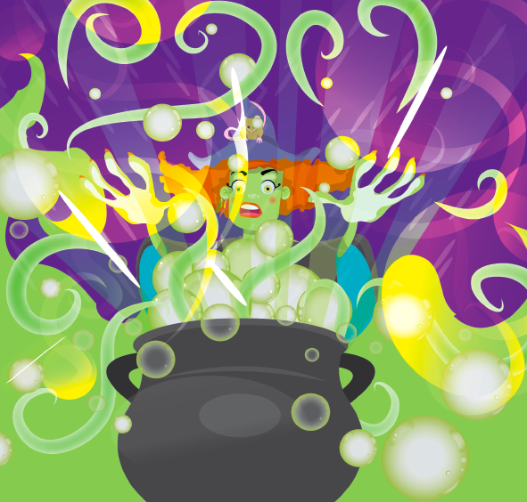
Where would a witch be without her cauldron?


A mini world map stylised to make the book more fun for kids


7.13.2011

Just got featured in a Pride Article


The lovely folk down at GAYSE.net asked for a bit of info about this years Pride campaign and the artist who created them. http://www.gayse.net/?p=3474

Another article on Gay Newry.com gave me a mention for the same campaign also. So I'd like to also thank them too.   http://www.gaynewry.com/?p=223​2


It's nice to see that the things we love to do can pay off in unexpected ways. :)

6.18.2011

Shortlisted for Hotpress Cover Competition

Shortlisted entry
Recently I entered the Hotpress Cover competition which coincided with the anniversary death of Thin Lizzy legend, Phil Lynott. The theme of the competition was musical icons. My idea involved using various printing technology techniques such as UV spot varnishes for the black and embossing the type. I was chuffed to bits to be selected to go onto the final round.
I found this competition very enjoyable, I find it important to note that the contact I dealt with over the phone/emails during the shortlisting stage had an incredibly nice manner.

6.10.2011

Exhibiting in Dublin Pride

Here's a sneak peak at a new piece I've been working on called Dream Catcher. I've been having a good few weird dreams lately involving sinking into people's heads, wandering eyes, beautiful creatures, fast moving objects, large letterforms and loud noises. I decided that it would be an interesting subject matter to explore a little further in terms of trying to visualise what the individual elements looked and felt like. The interesting thing is that since creating the piece, those particular dreams have stopped, Hence the name.


6.02.2011

Dundalk Gay Pride 2011 Campaign- This Time It's Bigger

Recently I got to work with Dundalk Outcomers, (a non profit organisation focused on LGBT issues) for the new Gay Pride campaign for Dundalk. This time we decided to build upon the existing materials but give the promotional materials and the brand a new lease of life. This came in the form of the pride birds. the colour of the birds is inspired by the multi coloured gay pride flag. These lil' fellas (and gals) take on various personalities and make some lighthearted comments about current gay culture. The strategy here is to build upon the fact that Dundalk offers something different to the other prides. It's smaller, very personal and targets the wider community to engage with the LGBT community. 

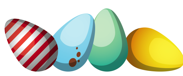
The Line up


The Campaign starts at easter to generate a bit of interest in the personalities and for people to grow to like them as the time goes on. We started this year with the idea of the pride eggs through social media like facebook and twitter. The basic premise is people can adopt a pride egg and own it see what it hatches into and follow their lil character through it's mini dialogues.

pride eggs shown from Easter Sunday onwards
The basic premise is people can adopt a pride egg and own it


Eggs begin to hatch on facebook in mid may
...see what it hatches into
one of the birds hatching from the purple eggs
...and follow the dialogue that stems from this through mini comics, simple animations and parodies

mini comic to be displayed in GCN and printed media


The poster's are to be used to raise awareness of the Dundalk Pride festival. It's a small event and will grow in time but as such could do with relating itself to other well known posters and materials for the general consumer to engage with.

HOPE
This poster is inspired by Frank Shepard Fairey's famous "HOPE"campaign for US president Barack Obama in 2008. This parody plays on the essence of a longstanding Hope for equality for LGBT people in the wider community.


Shake your tail feather
Pride began politically in response to the Stonewall riots, but it's important to remember to have fun and celebrate at a gay pride event. It's for everyone, the Uncle Sam poster by James Montgomery Flagg was chosen for the emphasis on the word "you". 


Encouragement through messages


J. Howard Miller's Rosie the riveter is commonly associated with the feminist movement and is a symbol of female power and independence. I wanted to use his poster as a reference point to represent the Lesbian and Bi Sexual women of the LGBT community.

All in all, the campaign is just released, so I thought it appropriate to blogg about it and get the word out there.

If you want to get involved with pride, or know more about it, then follow this link


I hope you enjoy reading/looking through these posts as much as I like writing about them. Feel free to add comments or opinions below. :)

5.01.2011

Cafe 105

The folks down at Cafe 105 on Capel Street were looking for an inspiring piece of graphics to draw the crowds from the heart of the city centre in dublin. I wanted to create something using illustrations that would engage with the young hip and trendy coffee doers and gossip queens. The place serves as a neat little hang out spot as well as an internet cafe of sorts. Inspiration stems from the likes of TADO and Peskimo...


I designed this poster as a way of communicating fun and eating together.

My research blog

So what's the big cahfuffle, why haven't I been posting lately? I'm currently doing a Masters in Professional Design Practice in Dublin Institute of Technology, Deadlines are drawing in closely and I've been flogged with new pieces of work to do left, right and centre. I'm also considering a switch on blogs. But don't worry I'll give you all the link so you can still follow me.

I've attached a link so you can see it if you're interested in research, if not, that's cool. I intend to keep posting there for the mean time with more creative endevours.

Click Here To See My Thesis In Progress

It's a little on the rough side at the minute and I haven't gotten around to adding all my research to it, but there's time for that later. Right now I've got a media law and strategic marketing presentation to get my head around.

Update

So I haven't really gotten a chance to post anything up lately but be warned, my next post is gonna be big. I've been getting up to alot lately, one such thing was for easter where I created a fund raising poster for the charity OutHouse and did the tickets too.

1.04.2011

HotHouse

Happy New Year everyone. I've had the delight of designing for a new project called Hothouse, A 12-hour non stop club in the heart of Dublin at 'The Twisted Pepper' on New Year's Day.

For this project I was requested to make a web banner, a mini-flyer, a poster and a logo. The promotional material needed to reflect a sense of quirkyness and difference to any other events held on the same day. A weatherhouse was suggested to me as an idea that could work quite well for a venue such as this. I'm quite happy with it, and I hope you like it too. 

Logo for Hothouse


Poster


Animated Web Banner


Mini-flyer


8.25.2010

Cuddly Creatures


Web Design, Product Design, Merchandise, Logo Design

The website features animated characters and logos.
This product range was designed to be sold in gift stores like Hallmark.
The Creatures were to be stylised in a series of different ways to keep the look a bit more versatile but in keeping with the theme of the brand itself.
The logo idea was to be cute and cuddly. I used a childlike font with soft pastels to relfect this and wrapped it in a bubble cloud.

The mugs were typography based with a tongue in cheek humour added to them.

8.23.2010

Sulis Holistics


Client: Sulis Holistics
Brief: logo design, Leaflet design and printable T-shirts Print.

For this project I used a series of cool colours to symbolise tranquility and health. The Typography on the front of the leaflet was hand rendered and then traced over using vector