8.25.2010

Cuddly Creatures


Web Design, Product Design, Merchandise, Logo Design

The website features animated characters and logos.
This product range was designed to be sold in gift stores like Hallmark.
The Creatures were to be stylised in a series of different ways to keep the look a bit more versatile but in keeping with the theme of the brand itself.
The logo idea was to be cute and cuddly. I used a childlike font with soft pastels to relfect this and wrapped it in a bubble cloud.

The mugs were typography based with a tongue in cheek humour added to them.

8.23.2010

Sulis Holistics


Client: Sulis Holistics
Brief: logo design, Leaflet design and printable T-shirts Print.

For this project I used a series of cool colours to symbolise tranquility and health. The Typography on the front of the leaflet was hand rendered and then traced over using vector

8.03.2010

Dundalk Pride 2010

Some of my designs for the Pride Fest in Dundalk. Invites, logos, tee shirts and banners designed by me. This project was good for me as it allowed me the creative freedom to do as I wished with a couple of guidelines. I helped launch the online campaign through the use of social networking sites such as twitter and facebook. overall it was enjoyable and gave me good experience, it was cool seeing my stuff being made around me and I hope that this happens more and more in the future.

5.21.2010

FREE: Pride Desktop Wallpaper

These wallpapers were designed for the Pride Festival in Dundalk, the branding and logos were to coincide with these graphics. I wanted simple graphics that were versatile and easily manipulated for any extra resources needed for the event. The wallpapers contain don't contain the same text as the rest of the campaign to keep a more illustrative and Wallpaper-ish feel to them.

Feel free to download these and use them, They're for screens with 1024px X768 px
If you want to request a different Res, Email me: jimmythestargazerdesign@gmail.com

Tangled Up Typography

Illustrative type treatment for "Tangled Up"
Personal Project- Typography Experimentation

This was a really interesting personal project, I tried to make sure that each of the characters were reacting to the tension of the lines between the respective letters.

5.17.2010

Logo Dr sketchy's Edinburgh


Dr Sketchy's is a burlesque themed life drawing club based in several locations all around the world. My Logo Design based on the art of burlesque is the negative and positive space in the silhouette of the female form. Using silhouettes as a backdrop the text becomes more legible as the logo needs to be able to be rescaled smaller. The tantalising photos and suggestive poses stem from burlesque and cheesecake poses

Flowers by Cassie


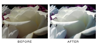
Photo Manipulations of the before and afters of making flowers more aesthetically pleasing. Two of the web design constructs that were thought of to give a solid solution to Cassie's flower arranging business online.

Enchanted forest Gift Wrap


inspired by folklore and old stories of fairies I decided to design a wrapping paper for any occassion. A few of my friends used to be obsessed with fairies and I think that if i wrapped a present in this paper, regardless of how much they liked or disliked the gift, they'd love the sentiment of this wrapper.

5.16.2010

Beauties and the Beast


This was an illustration I created as a personal piece blending the beauty of nature with the aesthetic of the female form...

3.15.2010

Quest For Knowledge And Bacteria Busters


Client- eZ Learning
Brief- Game Design, Art work, Concepts, Character Design


Bacteria Busters is another game design with built in learning. You'll join Buster on his mission as an antibody to combat the threat of Infections and viruses in the body. Collect pills, shoot things with an arm beam and know that at the end of the day you've just about saved one persons life. Rewarding, no?

Quest for Knowledge is a Game design based on the principles of problem solving. find clues to unravel mysteries, learn fun facts about the earth and unlock bonus mini games!

The New Wave Aquarium Website


Client- The New Wave Aquarium
Brief- Logo and Graphics for Website

Graphics and logo designed for The New Wave Aquarium website. The company wanted a sophisticated website that branched away from traditional blue sea colour schemes. For the logo I encorporated the silhouette of a fish into the wave combining the creature with its element.

2.10.2010

Funnel Master T shirt Design


Client- Kit Designer
Brief- Design a T shirt as a prize for a Drinking competition.

The competition was entitled "The Funnel" and the winner crowned "Funnel Master", So I used this as the basis of my design concept.

The inspiration for this piece was Karate Competitions, winners and the gold place, beer funnels and spillage.
Key Features include the karate style silhouette, the funnel itself and the word master being made from a pipe used for the funnel
Colours were kept within a yellow gold range to tie in with 1st place&gold. Black and grey break up the piece and add depth.

Walkers Point of Purchase Display unit.


Client- Walkers crisp
Brief- Design an in-store P.O.P. (point of purchase) that places emphasis on the home grown potato side of crisp manufacturing.

Inspiration- all things natural and bright.

for the in-store display I made my piece from cardboard. Cardboard can be easily flat-packed, it is light and recyclable. One would fit more onto the back of the lorry for shipping and distributing, which in turn would mean less vehicles needed which would reduce the overall carbon footprint for the company.

all the illustrations on the display are vectorised, which means that the display could be resized and the quality of the images would not depreciate. the front of the tiers have a potato as the flavour indicator. The sides display a range of nature and farming images in earthy browns greens and yellows. The logo on the backboard acts like a sunrise over the farm (that is the display). Wobblers (pieces of graphic printed onto card and attatched to the main display by means of a clear narrow line of transparent plastic) are placed around the logo to entice children to get their parents to buy the goods for them.

manifest illustration


This was an illustration that I did as a concept for a men's product range entitled Manifest.
The Graphics were chosen for the every growing popularity in packaging with illustration, my target market for this project was the modern male metrosexual, i thought it fitting to add flares of dramatic pink and gold. traditionally associated with femininity. Guns, roses skulls and fast cars were used in this piece to make sure that there was little to no mistake that the product is fashionable yet manly.

Private View Party Poster and Tickets


A collaboration with Designer Claire Davies.

Design used to advertise an exhibition and after party at West Wales School of the Arts.

CMYK process colours used to subtley reinforce the design faculty, a faculty that I hold close to my own heart.

T Shirt Design


T shirt print Designed as merchandise for an RPG computer Game.

Greed is one of the characters in the game, I thought it appropriate to do print based on money and capatalism. Taglines such as "enough is never enough" and "in association with greed corporations" embelish the design.

2.09.2010

Connected Scotland


Resource Advertising Event in Edinburgh, Scotland.
Corporate colours were used as a basis of inspiration, the poster is text heavy to keep the poster ambiguous, Graphic Elements such as the lines and sticker effect give the piece some substance.